House-bound in the snow (which has not been as big a deal for us as predicted) I just noticed I haven't posted any quilting projects in some time. I made one for a gallery show curated by my friend Dorry that is going on right now. The small quilts were to hang as a group, representing the artists whose work was hanging in the show. Here is my entry, called Green Weaves
Dorry asked each of us to make a relatively long, skinny quilt mostly in pale neutrals, with green as an accent used in small doses. My quilt was 9.5x45 before I quilted and faced it. I used the gradient dyed green from Vicki Welsh on my paper-pieced project. My friend Ellen let me use strips of her gray fabrics so I had a wide variety of color and texture in the limited palette.
The quilting is done in threads that also shade light to dark, top to bottom, and are curved in a design loosely based on the topographic lines of the mountain above our house.
You can see photos of how Dorry put the entries together in the gallery exhibit in her post - Threads at the Exhibit
Click on the link for the next older post at the bottom of that one to see more of the quilt show, Threaded with Green at ArtSpace Herndon. A couple of my Seasons challenge quilts made over the last year show up so you can see what other quilters did with the same vintage quilt blocks I had. (click on the "challenge" label associated with this post and you'll see all four of those I did.)
Showing posts with label Challenge. Show all posts
Saturday, January 23, 2016
Tuesday, March 17, 2015
The Last Season
I've just finished the last of the little quilts out of "orphan" vintage blocks that made up the Four Seasons Challenge series led by my friend Dorry. The starting block for Winter was a stained and not-quite-square blue and white Churn Dash. I decided I would just soak it to try to remove the stains (they were stubborn) and then work with the block as it was. Like all the Season Challenges, the quilt was to finish at 24" square and we were required to use green on the face of the quilt. I have some beautiful wintery green and gray fabrics that I set out to use in the setting. To make this one different from any of my others, I had the Churn Dash block be the main element without being in the center of the quilt. I planned to use the wintery green prints as cornerstones and setting triangles, or sashing.
I picked a starry block to go with the Churn Dash because my design wall was looking like a night sky when I started pulling my navy blue fabrics out. Notice that my collaborator of years gone by had two different blue and white prints in her churn dash block (it's the large scale one lower right.)
Obviously, the green setting fabrics didn't make it into the quilt. A deep blue that has streaks of green that I didn't use in any of the stars has to play the part of the green. I had already chosen a very pale green fabric for the nine patch of the star blocks figuring it would tie my blocks in with the intended setting. So I managed to follow the guidelines in spite of my change of heart.
When I was making my label, I looked up the name of the star block I had chosen. I was surprised to discover that one of the historical names for it is Churn Dasher! Maybe you can see the green in the closeups.
Some of my deep blue prints were starry skies -
- so I chose to call this quilt Moonlit Midnight. I really enjoyed quilting such a small quilt right after finishing the more involved World War I project.
Green fabrics are entirely responsible for the pieced backing.
The trees fabric was the original leading candidate for the setting triangles. I took this photo while my computer-printed label dried, and shipped my Winter Challenge off to Dorry this afternoon.
Now that those two quilt deadlines are met, I have a new project to start. If you read our "main blog" you know we have been working with Interior Designers to get some repairs done and finish decorating our retirement house. While I thought we had Too Much Wood in our Master Bedroom, the professions didn't care for much of anything we have going on there. I'm embarking on an experiment with an idea to add a painted nightstand. At a nearby estate sale, I found this TV stand with a $15 price tag on it.
Norris doesn't like it because it's veneered MDF, so he paid $10 and stipulated it's not to stay. But I figured I could try painting it, put it in the room and see if something like it will be a simple solution to the Too Much Wood question, while I look for another piece that will no doubt cost a little more. I have calculated I could invest in a couple of dozen experiments twice the price of this piece and the paint, and still have plenty of money left over to buy a few brand new pieces of furniture for the price of one of the designers' solution nightstands.
Friday, November 14, 2014
Seasons Challenge - Fall
When last seen, the Fall challenge was a single Ohio Star block with a very bright solid orange fabric (photo at this link).
I took the main block seams apart so I could square up the block for easier piecing. My friend Judi scheduled another Dye Day in her nearby studio, so I brought the quilt block pieces. She suggested I try a bleaching technique to change the character of that orange. It happened I had brought along stencils so I tried painting the thick mild bleach solution through the stencils to create an interesting design, but whatever the dye was, it was quite stubborn. By the end of the day, it had done what it was going to do, which wasn't much.
Back at home, I printed a maple leaf graphic on freezer paper, cut it out and centered it on the orange squares. I used black and blue watercolor pencils around the edges of the freezer paper stencil for another layer of design on the fabric. Here's how the block looks now, pieced back together and much closer to square (only very minute shavings had to come off the orange pieces and the hourglass blocks).
I wanted the vintage block to stand out among the fabrics from my collection I chose to go with it. With the blue-purple print and the leaves, I think it is obvious even in the small view. It's not the typical "fall quilt" but all of the prints in my little hourglass blocks feature leaves. The plain squares are hand dyes and prints that look like hand dyes.
I took the main block seams apart so I could square up the block for easier piecing. My friend Judi scheduled another Dye Day in her nearby studio, so I brought the quilt block pieces. She suggested I try a bleaching technique to change the character of that orange. It happened I had brought along stencils so I tried painting the thick mild bleach solution through the stencils to create an interesting design, but whatever the dye was, it was quite stubborn. By the end of the day, it had done what it was going to do, which wasn't much.
Back at home, I printed a maple leaf graphic on freezer paper, cut it out and centered it on the orange squares. I used black and blue watercolor pencils around the edges of the freezer paper stencil for another layer of design on the fabric. Here's how the block looks now, pieced back together and much closer to square (only very minute shavings had to come off the orange pieces and the hourglass blocks).
I was pleased with the end result - I think that garish orange has a lot more interest and texture. You can best make out the bleached design in the center leaf where I outline quilted only - it's a four way symmetrical design that makes an "orange peel" center.
When it came to setting the block into a quilt, I turned to the Quilt Index for Ohio Star quilts and settled on one that just alternated the hour glass blocks and squares.
I quilted it in a light pink thread, as though it was 5 Ohio Stars set with alternating plain blocks. The feathers have a sprinkling of stylized leaf shapes.
The backing and binding are made from a fabric that combines orange, pink, and magenta with greens.
I named the quilt "Maple" in keeping with my single word titles for the previous two season quilts.
Thursday, October 16, 2014
Seasons Challenge Series - an Ohio Star block for Fall
Just as the fall season struck, Dorry sent me the block I get to use for the next challenge quilt, an Ohio Star with a really bright solid orange fabric -
Wow.
Our long ago quilting sister had a little problem with her orange fabric. It looks like she tore strips and the squares wound up as rectangles. Meanwhile, the quarter square triangles on the two sides are cut with the bias on the outside edge - you can see how they have stretched out of shape and bulge on the sides.
I'm planning to leave the block as she designed and mostly how she made it - though I did take it apart, and a bit of trimming to make the "squares" square so this will fit into a nice flat quilt might have happened before I put it back together. It was not possible to get all the points to stay pointy but the result is something she would recognize if she were able to see the quilt I'm going to make from this block.
I wrote that like I know where I'm going with this challenge. I have some ideas, but I'm not ready to start cutting and stitching. The blue-purple of the triangles is related to my Jane Austen blocks, but one of the challenges for this quilt is to include green in the finished quilt. This block has no relationship to green and what I'm doing for that series has no green either, so I have to stop thinking about that.
Wednesday, September 10, 2014
End of Summer
Following up on my Start of Summer post I have finished turning the Carolina Lily block into a little quilt for the seasons challenge. As I looked at the colors in the original block and the colors that came
up when I searched for summer images, I found watermelons.
There are lots of watermelon quilts out there if you do an image search. I chose not to portray the seeds as literally as most but the dotted black and white print in the binding is a nod to them. The black and white flower pot was the jumping off point for the large-scale checkered background to the blocks made in an original Drunkards Path style.
There was a permanent stain next to the flower on the right side of the original block that didn't bother me, but stood out to Norris. A little butterfly appliqued on, Broderie Perse style after the quilting was finished, hides that issue.
My quilting was a little more whimsical than usual for me, with the casual loops on the rinds of the slices and in a ring on the outer part of the pink watermelon flesh.
The back is the pretty daisy print from Sherrye's mother's stash.
Wednesday, August 27, 2014
The Start of Summer
I know we are nearing the End of Summer - but I'm talking about a Challenge Quilt, the second in our Seasons Challenge series.
The block for Summer is a quirky Carolina Lily. I have rotated it so you can fully appreciate our by-gone quilter's original touches.
She has chosen that bold little black and white print for the vase or flower pot. I'm used to seeing baskets of flowers with little triangles at the sides for feet, with background to fill in the lower point and no little handles, but our version has been seen before, published in 1981, according to our favorite quilt block source, Barbara Brackman. Here's how it's colored in Blockbase, the software version of her catalog.
The block has also been cataloged as Royal Dutch Tulip and Vase, and as Royal Japanese Vase - those names being older than Carolina Lily for this version, though the quilts I saw by searching the Quilt Index under all of these names have some version of the two smaller triangles at the sides of the vase rather than this one - is that maybe an unsupported triangle on a table?
What I thought was the most original innovation our quilter made, changing the base of the flower to pink and turn two of the petals into leaves, perhaps envisioning a tulip, has also been done before, I found in my searches for Lily quilts. But a unique touch was her use of a deeper green for the stem (and handles) as she used for the leaves.
Her piecing is definitely quirky - there are some very interesting seam lines in those pieces she used for the background, I have decided to leave her block intact.
You can see that it was probably intended to be a 12 inch block. It's going to take just a little trimming and an additional sliver of muslin or two to get it to quilt flat without putting pleats in the work someplace.
I'm going to celebrate summer and this block in my setting, which uses an original variation on a traditional block. Nothing to do with Carolina Lilies, or Tulips, or any other flower.
Saturday, June 14, 2014
There is a Season - Spring: "Trillium"
This year, the "new from old" challenges Dorry is issuing have a new theme, the four seasons. I posted a photo of the starting block back at the beginning of Spring - it looked like this -
Since I am not especially fond of boats, I used the block as a source of fabric. You will notice that my long-ago collaborator had no special respect for grain. The background fabric really shows this well. This is why her block is not square and there are serious issues with the points of the triangles. I took her hand-sewn block completely apart and starched the pieces thoroughly, over and over, until they were as stiff as paper. See how they can stand up and hold each other up.
When I wrote about this challenge in April, I was pondering my color scheme. All the quilts in this series will incorporate green. I studied a lot of images on Design Seeds and came up with a sort of hybrid of several of the spring-flower inspired palettes that combined green and a pink somewhat close to that of the boat block.
I think all my previous quilts for these challenges (except elements of the Dresden Plate), were pieced, so, with the Design Seeds photos' fresh in mind, felt it was time to do some more applique.
I wanted to design my own flower, and settled on the simplicity of the trillium, which is a native in the woods here. The smaller pink flower with the green center is straight out of the Electric Quilt library and serves as filler in my leaf wreath. The bunny also comes from Electric quilt. Including a bunny was highly influenced by our Challenge Master herself, as she had chosen Easter as the theme of her most recent Round Robin quilt, and started us off with some very cute bunnies on a pastel block.
We are supposed to use 100% of the starting block on the front of the quilt if possible. I designed the background to use the the fabric from the boat hull, visible in the larger pink piece top right. I then sewed the sail pieces together to make the piece I used on the bottom left so it would not be covered by the applique. After that, I took the background pale pink and cut it for the small corner triangles in the blocks but had some leftover pieces. I placed them on a too-bright pink fabric and held them in place with sheer iron-on interfacing, which you can see in the lower part of the larger piece in the corner block.
But I still had some little slivers of fabric I trimmed off when I got done cutting out the pieces for the face - so I used them in an extra block on the back of the quilt.
The backing fabric is a small part of a very large piece that Sherrye gave me for Dana's green and yellow Grandmother's Choice quilt. I'm trying not to buy fabric for any of these New from Old challenges, and that fabric seemed like a perfect late spring choice.
The bunny's eye was fun - they always tell you not to make the eyes just black - they need a catch light. I would have used a dot of white fabric paint, but a circle cut from the batik we used in Judi's Healing Cloak served my purposes even better.
My quilting was pretty simple with a lot of parallel straight lines. I really love the effect it has combined with the triangles printed on the teal fabric just behind the bunny's nose.
Since I am not especially fond of boats, I used the block as a source of fabric. You will notice that my long-ago collaborator had no special respect for grain. The background fabric really shows this well. This is why her block is not square and there are serious issues with the points of the triangles. I took her hand-sewn block completely apart and starched the pieces thoroughly, over and over, until they were as stiff as paper. See how they can stand up and hold each other up.
I've read that starch can only do so much to help with grain problems, and I certainly found that to be true. The boat fabric was a feedsack, and the background pale pink was also a very loose weave, and neither one stayed straight as I pieced the background of my little 24 x 24 inch quilt. I had a lot of difficulty with the points matching up. But no matter, I had more plans for this piece.
I think all my previous quilts for these challenges (except elements of the Dresden Plate), were pieced, so, with the Design Seeds photos' fresh in mind, felt it was time to do some more applique.
I wanted to design my own flower, and settled on the simplicity of the trillium, which is a native in the woods here. The smaller pink flower with the green center is straight out of the Electric Quilt library and serves as filler in my leaf wreath. The bunny also comes from Electric quilt. Including a bunny was highly influenced by our Challenge Master herself, as she had chosen Easter as the theme of her most recent Round Robin quilt, and started us off with some very cute bunnies on a pastel block.
We are supposed to use 100% of the starting block on the front of the quilt if possible. I designed the background to use the the fabric from the boat hull, visible in the larger pink piece top right. I then sewed the sail pieces together to make the piece I used on the bottom left so it would not be covered by the applique. After that, I took the background pale pink and cut it for the small corner triangles in the blocks but had some leftover pieces. I placed them on a too-bright pink fabric and held them in place with sheer iron-on interfacing, which you can see in the lower part of the larger piece in the corner block.
But I still had some little slivers of fabric I trimmed off when I got done cutting out the pieces for the face - so I used them in an extra block on the back of the quilt.
The backing fabric is a small part of a very large piece that Sherrye gave me for Dana's green and yellow Grandmother's Choice quilt. I'm trying not to buy fabric for any of these New from Old challenges, and that fabric seemed like a perfect late spring choice.
The bunny's eye was fun - they always tell you not to make the eyes just black - they need a catch light. I would have used a dot of white fabric paint, but a circle cut from the batik we used in Judi's Healing Cloak served my purposes even better.
My quilting was pretty simple with a lot of parallel straight lines. I really love the effect it has combined with the triangles printed on the teal fabric just behind the bunny's nose.
Wednesday, April 2, 2014
A new Challenge Series begins
Dorry is always the one to come up with these great ideas and organize groups of quilters to stretch and create quilts beyond our comfort zones! We finished the June Bride series when the Bride finally had her day, so now we're on to a one-year-long/four quilt project that will also have vintage quilt blocks as the starting point. This series is based on the seasons, the first being Spring. I got my block a week or two ago.
We are to include the color Green in these quilts. I thought I might be able to use some of the green and yellow fabrics I had for Dana's quilt, but that was before I saw this particular pink. Except for the fabrics than included black, most of the fabrics I had looked too toned compared to this coral sort of pink and I didn't want black for spring.
I looked at my floral prints that included bright pink. Since pink and green are a common combination, I get a feeling that for me, starting with these would take something away from the challenge. I've taken that approach before, with two of the fabrics in this group, actually. The roses on the left would be a challenge if I were to incorporate all the tonal browns, so I was leaning that way, but I'm not sure the combination would read 'spring' very loudly in a 24"x24" quilt.
You might rightly protest that the peony on the lower right is not a fabric. It's a card Dorry sent on another recent occasion, a print of a watercolor by Great Falls Studio Artist Linda Jones. The bright pinks with the dark green is a winning combination. Linda's palette adds a touch of orange and a hint of purple to the mix -- but I used that in my Reston quilt based on the fabric just above it. I haven't quite decided yet, but have spent some time on color-palette websites to get an interesting and challenging combination that might not be found in my fabric collection.
After the colors decision, the problem of how to incorporate the vintage block in a quilt remains. I have made no secret of the fact that I prefer geometric fabric shapes just make geometric patterns without trying to represent real objects like a boat. I cut up the last of the June Bride blocks to use it like fabric - but only because I hadn't done that before and wanted to try it. I think for this quilt I will try to use the original shapes, if not all of the original piecing. We are as always supposed to use just about all of that vintage block for the challenge. Hmmm.... I wonder what kind of block uses that boat-bottom shape?
Tuesday, December 24, 2013
My Mother Always Said
Dorry is always coming up with creative new ideas for quilters, and now, in the middle of organizing Something Blue, a show of quilts at the ArtSpace Herdon gallery starting in mid-January, she has another. (A click on the show title will take you to the ArtSpace Event page.) With just over a month before the show's opening, she issued a challenge on the theme of something your mother would say. The quilt was to be 12 inches square and was to include the color blue.
My mother, like all mothers, had her favorite sayings, but hers weren't the typical ones at all. She would say, "Decisions, decisions!" when you were trying to make up your mind. She would say, "First mistake I ever made" whenever she made one. She would say, "I'm in the garbage!" when you came home and called out, "Mom, where are you?" I asked a couple of my siblings for help to get a saying I could make a quilt from.
Brother Roger came up with "Learn something new every day" which he remembers both my mother and her mother saying. Mom would say "You learn something new every day" whenever something she hadn't heard of before came in front of her, but I chose to use it as my brother quoted it - more as a piece of motherly advice. In this age of lists of recommendations for how to age better, learning new skills - both physical and mental - is always at the top.
Norris and I are constantly looking for ways to expand our brains and physical skills. So I set out to make a quilt using techniques I have never tried before, and came up with painting with water color dyes on silk. I had recently purchased both the Derwent Inktense pencils and some mix-with-water fabric dyes.
I knew enough not to try to make my first piece be the final one. I thought the blue part of the quilt would be the Blue Ridge mountains and started experimenting on a 6 inch square piece of silk ironed to freezer paper. This is a cropped view of that effort - the other edges have color experiments on them.
I started with that purple which got away from me right away, and I didn't like the pencil lines in the sky, but the blue and black mountains and the foliage part are not too bad.
My next effort was 6 x 12 inches and I already had much better control of the flow of color for the mountains.
But then I was unhappy with the limit of the colors I could get with my 6 Inktense pencils and borrowed Derwent Watercolour pencils and Graphitint pencils from my friend Ellen. I experimented a bit more and I thought I was ready to try my hand at the real deal. Here's a crop of the upper half of that effort.
I was really happy with my sky technique by this time. I was working slowly, only on dry areas, so I also did some on the lower part of the scene, with the foliage. I know that watercolors bleed, but this time, I created such a sharp line of green where I didn't want it and it couldn't be fixed. I also only at this stage realized that the new pencil colors reacted and spread differently than the ink ones I started with.
The bluebird was Mom's favorite. With this simpler image using fewer colored layers, I could outline the original bird with black thread and make something recognizable. I liked the butterflies print for the binding as it has the blue and the touch of purple I used for tinting the sky.
I quilted my bluebird on a floral backing that also included blue and purple and a hint of the pink-red.
Now I'm curious to see what the other quilters' mothers always said and how they interpreted those words into a quilt.
My mother, like all mothers, had her favorite sayings, but hers weren't the typical ones at all. She would say, "Decisions, decisions!" when you were trying to make up your mind. She would say, "First mistake I ever made" whenever she made one. She would say, "I'm in the garbage!" when you came home and called out, "Mom, where are you?" I asked a couple of my siblings for help to get a saying I could make a quilt from.
Brother Roger came up with "Learn something new every day" which he remembers both my mother and her mother saying. Mom would say "You learn something new every day" whenever something she hadn't heard of before came in front of her, but I chose to use it as my brother quoted it - more as a piece of motherly advice. In this age of lists of recommendations for how to age better, learning new skills - both physical and mental - is always at the top.
Norris and I are constantly looking for ways to expand our brains and physical skills. So I set out to make a quilt using techniques I have never tried before, and came up with painting with water color dyes on silk. I had recently purchased both the Derwent Inktense pencils and some mix-with-water fabric dyes.
I knew enough not to try to make my first piece be the final one. I thought the blue part of the quilt would be the Blue Ridge mountains and started experimenting on a 6 inch square piece of silk ironed to freezer paper. This is a cropped view of that effort - the other edges have color experiments on them.
I started with that purple which got away from me right away, and I didn't like the pencil lines in the sky, but the blue and black mountains and the foliage part are not too bad.
My next effort was 6 x 12 inches and I already had much better control of the flow of color for the mountains.
But then I was unhappy with the limit of the colors I could get with my 6 Inktense pencils and borrowed Derwent Watercolour pencils and Graphitint pencils from my friend Ellen. I experimented a bit more and I thought I was ready to try my hand at the real deal. Here's a crop of the upper half of that effort.
I was really happy with my sky technique by this time. I was working slowly, only on dry areas, so I also did some on the lower part of the scene, with the foliage. I know that watercolors bleed, but this time, I created such a sharp line of green where I didn't want it and it couldn't be fixed. I also only at this stage realized that the new pencil colors reacted and spread differently than the ink ones I started with.
I considered cutting this piece apart and appliqueing other fabric on top of my water color mountains for the foliage, but by this time I concluded this scene was too complicated for a beginning fabric painter like me, and went to Plan B.
I quilted my bluebird on a floral backing that also included blue and purple and a hint of the pink-red.
Now I'm curious to see what the other quilters' mothers always said and how they interpreted those words into a quilt.
Friday, July 5, 2013
A Surprise Win!!
Back in April, I showed a small quilt I worked on with five other quilters, Time for Tea. You can see my post at this link with photos taken prior to completion of the binding. On Wednesday, I got a call from Alice from the group who went to the reception for participants at the Quilt Alliance offices in Asheville - our little quilt took the grand prize in the contest! Here's the little quilt, photographed by the Alliance:
You can see all 90 quilts in the competition on the Flickr page with some detail shots here - http://www.flickr.com/photos/quiltalliance/with/9107565271/
When you get to the five-sided (house-shaped) quilts, those are from a prior contest. All the quilts also currently show up on the Quilt Alliance website here - http://www.allianceforamericanquilts.org/
The three judges for this contest are very well-known in the current quilting world: Mark Lipinski, Paula Nadelstern and Marianne Fons. Mark Lipinski has a radio podcast, and called Alice to talk with her about the quilt. He proclaimed using the Hot Cross Buns to portray the 20 theme was brilliant, and that the quilt was amazing. They were impressed that we did a slice quilt at this scale (20x20 inches).
For our grand prize, we won a HandiQuilter Sweet Sixteen, which is a mid-sized machine designed for quilting. With my full-size longarm (23 compared to 16 inches), I don't need the machine, and some of the other quilters have been moving and downsizing, so they won't want to keep it at their homes. We have not yet decided what to do with the prize, but winning a prize was not the point anyway. The quilts will be shown and eventually will wind up for auction on Ebay as a fund raiser for the Quilt Alliance.
Alice also mentioned that the photo of our winner will be printed on tote bags, and I'll get one of them. Now that's a cool prize!
![]() |
Time for Tea |
You can see all 90 quilts in the competition on the Flickr page with some detail shots here - http://www.flickr.com/photos/quiltalliance/with/9107565271/
When you get to the five-sided (house-shaped) quilts, those are from a prior contest. All the quilts also currently show up on the Quilt Alliance website here - http://www.allianceforamericanquilts.org/
The three judges for this contest are very well-known in the current quilting world: Mark Lipinski, Paula Nadelstern and Marianne Fons. Mark Lipinski has a radio podcast, and called Alice to talk with her about the quilt. He proclaimed using the Hot Cross Buns to portray the 20 theme was brilliant, and that the quilt was amazing. They were impressed that we did a slice quilt at this scale (20x20 inches).
For our grand prize, we won a HandiQuilter Sweet Sixteen, which is a mid-sized machine designed for quilting. With my full-size longarm (23 compared to 16 inches), I don't need the machine, and some of the other quilters have been moving and downsizing, so they won't want to keep it at their homes. We have not yet decided what to do with the prize, but winning a prize was not the point anyway. The quilts will be shown and eventually will wind up for auction on Ebay as a fund raiser for the Quilt Alliance.
Alice also mentioned that the photo of our winner will be printed on tote bags, and I'll get one of them. Now that's a cool prize!
Monday, May 13, 2013
The June Bride - Part 5
When last I wrote about this project I was contemplating what to do with the magenta and off-white album block. (You can see the starting block in this post from March) The 24x24 inch quilt is almost ready to ship off to Dorry. I'm calling it Strawberry Fields Forever.
The design is my own variation on the traditional Double Wedding Ring pattern. I made one set of rings narrower in plain white, and the other is slightly wider, in three shades of green.
Here's an angled look at it in the afternoon sun so the quilting shows up better.
The darkest of the green fabrics that makes up the rings was one I believe I won as a "free" bonus with a purchase of fabric on the internet. It was a cheery shade of green and had both the magenta of the Album block and the blue required by the challenge.
Obviously, I did cut up the album block. I figured out that cutting it into 25 pieces, they would wind up the right size to fit in the shapes between the arcs of the 12-inch rings. But my design needed 32 pieces. Dorry provided us with an off-white fabric that closely matched the muslin of the vintage blocks, but only one of my 25 pieces would be plain muslin. I had saved a bit of gift-package ribbon of the right color that I used on top of 16 of the square pieces, then used those in a regular 4-patch distribution. Some of those squares are almost entirely pink, even though I only covered about half of any block - I didn't have enough of the ribbon to do much more, and I melted some of it trying to iron it on the normal high setting I use for quilting cotton.
I knew the cut up block partially covered in ribbon would wind up in a crazy-patch look, not my favorite, but this after all is a challenge and a chance to try something I normally wouldn't do. I decided it reminded me a little of Victoria Findlay Wolfe's Best of Show quilt at the first Modern Quilt show (QuiltCon), Double Edged Love and I went for it. (The link is to Victoria's blog entry about her win.)
This was a difficult piecing job and not one of my better ones, but now I'd like to make a "real" Double Wedding Ring quilt some day (maybe soon?) with scrap fabrics for the traditional wedges that make up the rings. I'll buy the plastic templates for that though!
Sunday, April 14, 2013
Time for Tea - Quilted
Here are some photos for the benefit of the other four quilters working on this slice quilt project - and Dorry, who had a lot to do with this. Click on the photos for a higher resolution version.
The whole quilt - I did undo part of Alice's right-most leaf so I could applique it over the seamline with Ann's - makes a nice touch!
Love how the plate really looks like glass, how realistic the violet appears, the button on the lid of the tea kettle and the "lace" edging on the napkin on that part, how perfectly Ann recreated the whimsical lemon pig, the dimension of the raisins and icing on the Hot Cross Buns .... and you can really see the dimension of the deck railing with the sun hitting the top.
I took this at a more oblique angle so perhaps you can see a bit more of the quilting.
This one has the quilt on its front with one side pulled over so my colleagues can see the backing and its scale with the front.
Yeah, it's a little crooked - the checked fabric was not printed quite straight on grain.
Thursday, April 11, 2013
Tea time!
Back in February, I joined up with a group of four local quilters who wanted to make a "slice" quilt for the Alliance for American Quilt's 20th Anniversary Quilt Contest. The quilts will eventually be auctioned in an on-line a fund-raiser, and the contest rules ask that the entries be 20x20 inches, and include the "20" theme.
My part was to find a photo that could be cut up and made in four parts to make a small quilt that would make a good impression in the thumbnail image auction buyers would be looking over. I spent a lot of time on a variety of ideas, looking for free-to-use images on the 20 theme. What about 20th anniversary? The traditional gift is china so I was looking at photos of plates and teapots and coffee services, which often show up in little quilts, but I didn't find anything I liked.
During the last week before my deadline, Norris helped - we went scouting for a good colorful photo opportunity. We headed to Main Street Weaverville. There is nothing at 20 S. Main but this space between the town hall and the former fire house.
So we headed to 20 N. Main, where there is an art gallery featuring works by local artists. Still on the china theme, Norris took this photo in the back with his cell phone. I worked at recoloring the brick to a brighter red, but getting a well framed shot with a surreptitious cell phone camera? It was just not going to make a great quilt.
We remembered the old mill wheel on the Reems Creek near Lake Louise was recently repainted, and what luck - it has 20 spokes!
I wondered if my photos didn't have just too much going on for a 20x20 inch quilt made in pieces by four people. I then looked on line and found a really beautiful photo taken in warmer weather with beautiful greenery in the scene. My photos just seemed dull after seeing that one, but the photo is labeled "All rights reserved" and by now, I have no time to ask for permission to use.
I staged some photos back at home. I have two pieces of inherited china, including this plate I thought was "quiltable". It was probably hand-painted by one of my ancestors, and doesn't have so much detail to interpret like my other inherited china plate.
But even on my red chair, it was a yawn for a quilt.
Maybe I could take the plate on a picnic. After a trip to the grocery store where we picked up a loaf of bread and strawberries to add to the mood, I took this photo in the back yard, with my one piece of inherited china layered on the blue plate ... Still maybe too much detail for the thumbnail version in the on-line quilt auction.
I whined in an email to Dorry, wondering how I could do my part for this project. Happily for me she was not too busy with deadlines of her own and got involved. She read the contest rules and sent a couple of interesting photos, like this next one.
My part was to find a photo that could be cut up and made in four parts to make a small quilt that would make a good impression in the thumbnail image auction buyers would be looking over. I spent a lot of time on a variety of ideas, looking for free-to-use images on the 20 theme. What about 20th anniversary? The traditional gift is china so I was looking at photos of plates and teapots and coffee services, which often show up in little quilts, but I didn't find anything I liked.
During the last week before my deadline, Norris helped - we went scouting for a good colorful photo opportunity. We headed to Main Street Weaverville. There is nothing at 20 S. Main but this space between the town hall and the former fire house.
So we headed to 20 N. Main, where there is an art gallery featuring works by local artists. Still on the china theme, Norris took this photo in the back with his cell phone. I worked at recoloring the brick to a brighter red, but getting a well framed shot with a surreptitious cell phone camera? It was just not going to make a great quilt.
We remembered the old mill wheel on the Reems Creek near Lake Louise was recently repainted, and what luck - it has 20 spokes!
I staged some photos back at home. I have two pieces of inherited china, including this plate I thought was "quiltable". It was probably hand-painted by one of my ancestors, and doesn't have so much detail to interpret like my other inherited china plate.
Maybe I could take the plate on a picnic. After a trip to the grocery store where we picked up a loaf of bread and strawberries to add to the mood, I took this photo in the back yard, with my one piece of inherited china layered on the blue plate ... Still maybe too much detail for the thumbnail version in the on-line quilt auction.
She counted 20 items, and included some subtle 20s - such as the clock which, for a final version, would have been set up to read 8:20, (If it's 8:20 P.M. that's 20:20 in military time.) But I figured my four quilting friends would kill me if I gave them this level of detail to do.
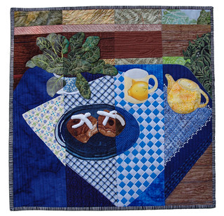
I then mentioned to Dorry that Norris had had an idea to depict 20 with the Roman numeral, two X's, and we had looked high and low for that - fences? Railroad crossing signs? The water wheel spokes? But I hadn't found anything satisfactory. Within what seemed like minutes of sending that email, Dorry surprised me by taking some photos of her Easter treats on various combinations of plates and mats. We melded that idea with some from her earlier tries and, on a windy day, she posed her dishes and buns outside.
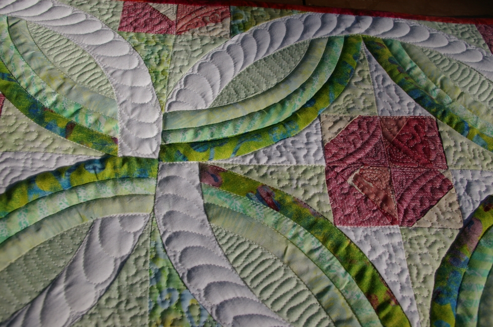
I printed her photo in four vertical slices and gave them to the quilters last month. Today, I have the four pieces ready to be sewn together and quilted - all four did a great job on their parts, and the details are simply exquisite!
The extra wide seam allowances are causing the large jags in the diagonal lines of the napkin, so I'll wait to take better photos of it when I finish my part. I think it will make a delectable entry and one that someone will be sure to bid on in the auction.
Subscribe to:
Posts (Atom)